

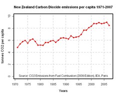
I am "quite fond of"/'obsessed with' making charts of variables indicating climate change. Here is a chart I have made with the R (programming language) that I have uploaded to Blogger. The source of the data is a spreadsheet from the report CO2 Emissions from Fuel Combustion (2009 Edition), International Energy Association, Paris.
R is a command-line program. The R code for the chart is:
co2pc <- c(4.80,5.40,5.77,5.98,5.52,6.04,6.20,5.80,5.19,5.22,5.15,
5.63,5.62,5.86,5.99,5.66 ,6.01,6.37,6.41,6.34,6.20,6.73,6.44,6.55,
6.62,6.99,7.67,7.67,8.09,8.36, 8.78,8.76,8.93,8.75,8.84, 8.99,8.48)
years <-c(1971:2007)
plot(years,co2pc,type='o',lwd=2,col=2,ylim=c(0,10),cex.lab=1.2,ylab='tonnes CO2 per capita',xlab='Years')
title(main="New Zealand Carbon Dioxide emissions per capita 1971-2007")
mtext(side=1,line=-1.5,"Source: CO2 Emissions from Fuel Combustion (2009 Edition), IEA, Paris")
abline(h=c(2,4,6,8,10),col='lightgrey',lwd=2,lty=2)
abline(v=c(1975,1980,1985,1990,1995,2000,2005),col='lightgrey',lwd=2,lty=2)
box(lwd=3)
I have recently used Flickr to store a couple of these charts. And you can embed them in a blog. Hence here is a chart of New Zealand emissions of Carbon Dioxide per capita from 1971 to 2007.
However it looks a bit fuzzy compared to the image uploaded to Blogger. It looks better over at Flickr.
Someone has asked NZ's line isn't very straight, is it? I wonder what happened in the mid 90s? Good question.
No comments:
Post a Comment