Showing posts with label R charts. Show all posts

06 June 2017

The latest inventory of New Zealand's greenhouse gases

Minister for Climate Change Issues, Paula Bennett and the Ministry for the Environment have released the latest inventory of New Zealand's greenhouse gases.

Minister Bennett and the Ministry have as their headline Greenhouse gas emissions decline.

I thought would I whip up a quick chart from the new data with R.

I pretty much doubted that there had been any discernible decline in New Zealand's greenhouse gas emissions to justify Bennett's statement. We should always look at the data. Here is the chart of emissions from 1990 to 2015.

Although gross emissions (emissions excluding the carbon removals from Land Use Land Use Change and Forestry (LULUCF)) show a plateauing since the mid 2000s, with the actual gross emissions for the last few years sitting just below the linear trend line.

Gross 2015 emissions are still 24% greater than gross 1990 emissions.

For net emissions (emissions including the carbon removals from Land Use Land Use Change and Forestry the data points for the years since 2012 sit exactly on the linear trend line. Net 2015 emissions are still 64% greater than net 1990 emissions.

There was of course more data wrangling and cleaning than I remembered from when I last made a chart of emissions!

The Ministry for the Environment's webpage for the Greenhouse Gas Inventory 2015 includes a link to a summary Excel spreadsheet. The Excel file includes two work-sheets.

One method of data-cleaning would be to save the two work sheets as two comma-separated values files after removing any formatting. I also like to reformat column headings by either adding double-speech marks or by concatenating the text into one text string with no spaces or by having a one-word header, say 'Gross' or 'Net'.

Of course, that's not what I did in the first instance!

Instead, I copied columns of data from the summary Excel sheet and pasted them into Convert Town's column to comma-separated list online tool. I then pasted the comma-separated lists into my R script file for the very simple step of assigning them into numeric vectors in R. Which looks like this.

Then the script for the chart is:

The result is that the two pieces of R script meet a standard of reproducible research, they contain all the data and code necessary to replicate the chart. Same data + Same script = Same results.

I also uploaded the chart to Wikimedia Commons and included the R script. Wikimedia Commons facilitates the use of R script by providing templates for syntax highlighting. So with the script included, the Wikimedia page for the chart is also reproducible.

NZ-ghg-2015

For comparison, here is my equivalent chart of greenhouse gas emissions for 1990 to 2010.

25 March 2017

Graph of atmospheric carbon dioxide concentrations from another cool data package

I feature another cool self-updating data package, this time of concentrations of atmospheric carbon dioxide recorded from the well-known Mauna Loa Observatory, in Hawaii. Graphs of this data are perhaps the most iconic images of anthropogenic climate change.

This post features the atmospheric carbon dioxide data package. Again, it is one of the Open Knowledge International (OKFN) Frictionless Data core data packages, that is to say it is one of the

"Important, commonly-used datasets in high quality, easy-to-use & open form".

The data is known as the Keeling Curve after the American chemist and oceanographer Charles Keeling. It is an iconic image for anthropogenic climate change.

Like the global temperature data package, the atmospheric carbon dioxide data package is open and tidy and self-updating and resides in an underlying Github data package .

Similarly, the data package can be downloaded as a zip file and unzipped into a folder. That will include the data files in .csv format, an open data licence, a read-me file, a json file and a Bash script that updates the data from source.

I can run the Bash script file on my laptop in an X-terminal window and it goes off and gets the latest data and formats it into 'tidy' csv format files.

Here is a screenshot of the script file updating and formatting the data.

Here is my chart.

Here is the R code for the chart.

16 January 2017

2016 the warmest year on record via a cool self-updating data package of global temperature

Radio New Zealand reports that 2016 was the new record warmest year in the instrumental record, so I will pitch in too. But with an extra touch of open data and reproducible research.

It's been a while since I uploaded a chart of global temperature data. Not since I made this graph in 2011 and then before that was this graph from 2010. So it's about time for some graphs. Especially since 2016 was the world's warmest year as well as New Zealand's warmest year.

When I made those charts, I had to do some 'data cleaning' to convert the raw data to tidy data (Wickham, H. 2014 Sept 12. Tidy Data. Journal of Statistical Software. [Online] 59:10), where each variable is a column, each observation is a row, and each type of observational unit is a table. And to convert that table from text format to comma separated values format.

I would have used a spreadsheet program to manually edit and 'tidy' the data files so I could easily use them with the R language. As Roger Peng says, the one rule of reproducible research is "Dont do things by hand! Editing spreadsheet data manually is not reproducible".

There is no 'audit trail' left of how I manipulated the data and created the chart. So after a few years even I can't remember the steps I made back then to clean the data! That then can be a disincentive to update and improve the charts.

However, I have found a couple of cool open and 'tidy' data packages of global temperatures that solve the reproducibility problem. The non-profit Open Knowledge International provides these packages as as part of their core data sets.

One package is the Global Temperature Time Series. From it's web page you can download two temperature data series at monthly or annual intervals in 'tidy' csv format. It's almost up to date with October 2016 the most recent data point. So that's a pretty good head start for my R charts.

But it is better than that. The data is held in a Github repository. From there the data package can be downloaded as a zip file. After unzipping, this includes the csv data files, an open data licence, a read-me file, a .json file and a cool Python script that updates the data from source! I can run the script file on my laptop and it goes off by itself and gets the latest data to November 2016 and formats it into 'tidy' csv format files. This just seems like magic at first! Very cool! No manual data cleaning! Very reproducible!

Here is a screen shot of the Python script running in a an X-terminal window on my Debian Jessie MX-16 operating system on my Dell Inspiron 6000 laptop.

The file "monthly.csv" includes two data series; the NOAA National Climatic Data Center (NCDC), global component of Climate at a Glance (GCAG) and the perhaps more well-known NASA Goddard Institute for Space Studies (GISS) Surface Temperature Analysis, Global Land-Ocean Temperature Index.

I just want to use the NASA GISTEMP data, so there is some R code to separate it out into its own dataframe. The annual data stops at 2015, so I am going to make a new annual data vector with 2016 as the mean of the eleven months to November 2016. And 2016 is surprise surprise the warmest year.

Here is a simple line chart of the annual means.

Here is a another line chart of the annual means with an additional data series, an eleven-year lowess-smoothed data series.

Here is the R code for the two graphs.

28 September 2016

Opening up the data or webscrape the 2015 free allocation of emission units from MfE

Let's look at the latest data on the very generous free give-aways of emissions units to emitters made by the Ministry for the Environment
(N.B. Update on 10 December 2016. The allocation decisions have moved to the web page of the Environmental Protection Authority. And the "importHTML" function in Google sheets does not work on the EPA pages.)

The Ministry for the Environment has up dated its webpage 2015 Industrial Allocation Decisions to show the final 2015 free allocation of emission units to emitters under the New Zealand Emissions Trading Scheme.

I looked at the 2010 to 2014 data in my post Opening up the data on emissions units in the NZ emissions trading scheme. So in this post I am will repeat my steps in web-scraping the freebie emissions unit data into a sensible open format.

The url of the webpage is http://www.mfe.govt.nz/climate-change/reducing-greenhouse-gas-emissions/new-zealand-emissions-trading-scheme/participatin-4

Go to Google and open a new Google sheet.

Enter this text in cell A1 of the Google sheet.

=importHTML("http://www.mfe.govt.nz/climate-change/reducing-greenhouse-gas-emissions/new-zealand-emissions-trading-scheme/participatin-4","table",1)

That worked perfectly! We have a Google sheet of the 2015 free unit allocation to NZ emissions trading scheme emitters.

I have saved it as NZETS-2015-final-allocations-for-eligible-activities.

However, the first column includes both industry names and types of industries classified by the type of emissions the industry produces. And lots of asterisks. Any sensible format would have these attributes as separate columns so that each company/emitter would have a row each.

So I used a programme called Open Refine to data-wrangle the data into that format and to save it as a comma-separated values file which is this Google sheet NZETS-2015-final-allocations-for-eligible-activities. Its a bit fiddly using Open Refine, so I won't describe how I did it.

This is the updated free emission unit allocation data from 2010 to 2015.

As usual, the big emitters get the most emission units! Of 4.417 million units allocated to industries, 90% went to 11 large companies. New Zealand Steel Development Limited, of arbitrage profits fame, gets 1,067,501 free units. New Zealand Aluminium Smelters Limited gets 772,706 free units.

I did a bit of data visualising and created this pie-chart in R programming language.

The R script for that is

Did I not get the End the Rainbow memo? So I picked a better colour scale from Colour Brewer.

The R script for this non-rainbow pie chart is:

06 March 2016

Surplus emission units in New Zealands Emissions Trading Scheme

The New Zealand Emissions Trading Scheme Review discussion document includes this statement about surplus emission units on page 10.

"There is a substantial number of banked NZUs owned by market participants, which combine with current ETS settings to weaken the effectiveness of the NZ ETS to assist New Zealand to meet its international obligations...
This stockpile of banked NZUs amounts to around 140 million units. This is several times the total number of units surrendered under current NZ ETS settings each year, which typically amounts to less than 30 million units.
Some of these units are held by foresters, who banked the NZUs they received as their trees grew. Other participants banked units they received via one-off allocations when the NZ ETS was first put in place, or accumulated NZUs by surrendering cheaper international units to meet their obligations and banking NZUs they purchased or received from the Government".

Did you notice the specific use of language? The word 'surplus' is not used. The preferred term is 'banked NZUs owned by market participants'. 'Banked units' implies that it's the fault of the market participants. Surplus units implies faulty design. As I have posted previously.

An effective emissions trading scheme with a real cap would never have surplus units. Units would be scarce and realistically priced. A surplus of units is of itself evidence of a failed implementation of cap and trade frameworks such as Kyoto and the EU ETS.

How many surplus units are there? The discussion document says 140 million units. I have doodled away with the R programme and some data from the Environmental Protection Authority's Emissions Units Register and have made a graph of the cumulative total of units held in the NZ Emissions Unit Register at the end of the calendar year, up to 2014.

The key point being that the cumulative total of all types of units, 588 million, at the end of 2014, exceeds the total 'compliance demand', 110 million, the number surrendered by emitters/ market participants from 2009 to 2014 by a factor of almost six.

We need to note that in the final accounting for the 2008 to 2012 Kyoto Protocol commitment period, New Zealand has to cancel some 373 million units to match our emissions.

Here is the R script.

Here is the data.

17 October 2015

New Zealand Gross & Net Greenhouse Gas Emissions 1990 to 2012

I have just prepared and revised a graph of New Zealand's gross and net greenhouse gas emissions for the years 1990 to 2012. I have recycled the style of the graph of gross emissions from 1861 to 2012.

NZ-ghg-2012-720by540

I have used html code from the scalable vector graphic I uploaded to Wikipedia Commons and not the Blogger template. I think it gives a better quality graphic.

The data is from Ministry for the Environment publication New Zealand’s Greenhouse Gas Inventory 1990 – 2012, Report ME 1148, ISBN 978-0-478-41242-0, April 2014.

The data and R programming language script are available at Wikimedia Commons.

12 October 2015

How I made the graph of NZ gross greenhouse gas emissions

Yes another post about my new line chart of gross greenhouse gas emissions in New Zealand. I have just uploaded a SVG version to Wikimedia Commons. On that page there is a link to the data source on Robbie Andrew's website and the background to the data and it's use in a publication.

The scaled vector graphic looks like this when the suggested template from Wikimedia is used.NZ Gross GhG Emissions 1861 to 2012

And I have uploaded the R script I wrote to Google Drive

.

11 October 2015

Graph of New Zealands gross greenhouse gas emissions 1861 to 2012

Robbie Andrew has compiled a data set of gross greenhouse gas emissions for New Zealand starting in 1861. So obviously that prompted me to make a line chart.

This image is set at actual size of 535 pixels.

This is an extra large sized image that is displayed too large for the width of the column.


This is a large sized image.

This is a medium sized image.

One point to note is that the line looks very smooth from the 1860s to the 1920s. That's because the data interval is one record per decade up until 1931. The data becomes an annual time series from 1933.

The other point is that the emissions data shows the same pattern of exponential growth highlighted in the global carbon dioxide graph featured by Duncan Clark and Mike Berners-Lee in The Burning Question.

16 March 2015

Does the NZ Emissions Trading Scheme affect retail petrol prices?

Of course, my title asks the wrong question. The more policy relevant question is "How much does the NZ Emissions Trading Scheme affect retail petrol prices?

Ministry of Business Innovation & Employment has a page on weekly oil price monitoring and some week by week data on petrol prices.

I made a R chart from that data.

Click on the image for a decent sized graphic.

The NZETS component of the NZ retail price of petrol pretty much just hugs the zero point on the vertical axis.

A note lower down the web page states "The costs associated with the ETS are provided by Hale & Twomey based on the prevailing carbon price from the New Zealand Carbon Market". So we need to note that this data is an estimate.

Over the four and a half years of the NZETS, the estimated NZETS component has ranged from a maximum of 2.4 cents per litre from late 2010 to June 2011 to a minimum of half a cent from July 2013 to December 2014.

As far back as 2007, the Labour Government predicted that petrol prices may rise up to 4 cents a litre possibly based on carbon price of $25 per tonne. From memory, the early 2011 price for a NZ unit was about $21 a tonne.

Wikimedia Commons has the R script I wrote for the chart (Except that it's for a .svg format, not .png format).

26 September 2012

Solid Energy and the declining price of coal; neither unforeseen or dramatic or a crash

On Monday Don Elder the Chief Executive of New Zealand's Solid Energy confirmed that a major restructuring of the NZ coal miner would require closure of the Spring Creek underground mine and the loss of 460 jobs over the company.

This move had been signaled in advance, but it is still making most news broadcasts today. Elder attributes the need to downsize to trends in international coal prices. For example Elder told Radio New Zealand;

an unforeseen, and dramatic, global price crash had rocked the industry.
"In the second week of July the markets tanked, demand fell through the floor," he said. In up to six weeks the price plummeted 40 to 50 percent and did not show any sign of bouncing back anytime soon."
The new chair of the board of directors, Mark Ford, said in a press release;
“The price for Spring Creek’s semi-soft coking coal would need to be somewhere from NZ$180-200 a tonne for the operation to deliver a profit and pay off the investment made in it,” Mr Ford said. “International semi-soft contracts are now being made at around NZ$120 a tonne.”

New Zealand PM John Key seems to have accepted the Elder view that prices are to blame.

"The issue isn't that we're not on their side, the issue is that international coal prices aren't on their side."

"In the case of Solid Energy it's a victim of falling commodity prices."

The NZ media seem to have uncritically accepted the price explanation. In one story, Fairfax reported the reason for the mine closure and job losses as being due to a severe downturn in global coal prices

Not so, "Chalkie", of the Fairfax NZ business section. "Chalkie" took Solid Energy to task for blaming their troubles entirely on the international coal price. Chalkie also satirised Elder's cornucopian Think Big-style lignite and coal-gas proposals.

Chalkie says he doesn't believe Elder has credibility when he says current coal prices in NZ$ are 20% lower than at the bottom of the 2008 global financial crisis. Chalkie points out that Elder's quoting of a coal price of $330 USD per tonne, as the top of the price mountain that the price has now fallen off, is just unrealistic.

In June 2011, a record price of $US330 a tonne for Australian hard coking coal, was reached because of supply shortages following the January 2011 Queensland floods which drowned most of Queensland's coal mines.

Chalkie also notes that a coking coal price of $USD126 a tonne is still well above the norm before the GFC. I have complied some prices for Australian hard coking coal. Data at Google Docs. Coking or metallurgical coal is used in steel making, and usually trades at a premium price above 'thermal' coal supplied to power stations. I prepared a chart of prices per tonne in $USD from 2006 to 2012. Spring Creek Mine coal is 'semi-soft' coking coal, which I think means its price is not quite the same as coking coal, but still more than thermal coal.

The post Queensland flood price of $USD330 a tonne sticks out as a spike or outlier as does the 2008 high of $USD250 tonne, which also followed a La Nina mine flooding event. Coal producers might not want to know about global warming, but global warming certainly knows about Queensland's coal mines.

And here is a chart of 2012 monthly hard coking prices in $USD. The data.

The price for Aussie had coking coal has fallen consistently in 2012. However,there is no cliff the price has fallen off in July 2012. The hard coking coal price did not plummet 40 to 50 percent in 6 weeks as Dr Elder says. The price trend is neither "unforeseen" nor "dramatic" and nor is it a "crash".

It's not hard to find reasons for the decline in the price. of coal. Reuters reports a number of reasons. Demand for coal is down in China. While the floods stopped the Aussie supply, steel makers looked to substitute other suppliers. Mongolia is increasingly eating into Australia's share of coal exports to China.

Chalkie also notes that the Huntly East underground mine has had some safety issues. Work to install a $NZ40 million ventilation tunnel, the sort of thing Dr Elder criticised Pike River Coal for not having, stopped in August 2012. Could it be that Solid Energy is using the international coal price as an excuse to avoid spending the money needed to make its underground mines as safe as the public now expect in a post-Pike River Coal disaster world?

Chalkie also notes a "field of dreams" approach to the Taupo wood pellet plant, (later written down in value by $NZ30 million) and delays in the Mataura lignite briquette plant. Given the execution of these smaller projects, Chalkie questions Solid Energy's ability to deliver on the grander lignite conversion plans.

I will leave the last word to Chalkie.

Every day at 8.30am sharp, management at Solid Energy would gather for morning prayers at the company shrine.
The small room was dominated by a huge gleaming slab of coking coal, etched with phrases from an early foreign exchange hedge contract. The dozens of executives stood facing it, arms by their sides, palms turned towards the slab in unison.
It was always a brief, uplifting affair. The CEO would begin with a chant: "Every day in every way, we expect coal prices to rise."
The executives would respond: "And rise they shall."
CEO: "With wood pellets and lignite we will rule."
Response: "Nothing bad will happen."
CEO: "Our big ideas are worth squillions."
Response: "Yes, probably more."
CEO: "Gentlemen, make it so."
And with that they would shuffle out shiny-cheeked into the morn
.

11 September 2012

New Zealand Aluminium Smelter Ltd do a Godfather; Nice smelter you got. Be a shame if something happened to it

The Godfather Robin Johnson's Economics Web Page argues that Rio Tinto-owned New Zealand Aluminium Smelters Ltd, the owner of the Tiwai Point aluminium smelter, is "Godfathering" the smelter, its workforce, the Southland economy, the NZ electricity market, Meridan Energy and the poor critically endangered slow-breeding kakapo, as well as "Godfathering" the NZ emissions trading scheme to get excessive free allocations of emissions units.

I have invented a new term for climate change blogging.

Godfathering!

Its a bit like Grandfathering, which is a bit of jargon from emissions trading. But different. Grandfathering in an emissions trading scheme (an ETS), is giving the emission units for free to the existing emitters in the ETS on a historic pro-rata calculation.

The units of course representing the desired cap on emissions. Alternatively the units could be sold by auction to emitters which is logical if we treat the units as shares in a public commons owned by the Government on behalf of citizens.

Of course our NZETS is not so simple. If our NZETS just applied simple "grandfathering" as outlined, then it would have a real cap, it would not allow importing of unlimited international units, and it would be impossible for any emitter to receive more units than their emissions.

Thats not the case under the NZETS, at least for some emitters. In 2010, the Rio Tinto Alcan subsidiary NZ Aluminium Smelters Ltd, which is roughly New Zealand's third largest point source of greenhouse gas emissions, was a net seller of units, not a net payer. Their free allocation of units was 135% more than the units they needed to surrender for their emissions.

That's excessive. The justification given for this is that in order to maintain their export competitiveness, NZ Aluminium Smelters Ltd needed to be compensated for the rather unfathomable and diluted ETS costs that may flow through their secret contract with Meridian Energy and the electricity wholesale market. I will come back to this later in the post.

Let me update the smelter emissions and unit allocations for the 2011 year.

In 2011, NZ Aluminium Smelter Limited produced 354,030 saleable tonnes of aluminium. The 2011 Ministry of Economic Development Chief Executive's Report shows that the New Zealand aluminium manufacturing sector (a.k.a. NZ Aluminium Smelter Ltd) reported emissions of 601,370 tonnes CO2-e for the 2011 year. We divide by two for the 'two tonnes for one unit' deal, and that results in 300,685 units to surrender.

The NZ Ministry for the Environment allocated 437,681 units to NZ Aluminium Smelter Ltd for the 2011 calendar year.

That's 136,996 more units allocated than surrendered or alternatively the units allocated to NZ Aluminium Smelter Ltd exceeded the units surrendered by 146%.

So that's even more excessive than 2010's 135% over-allocation!

How did NZ Aluminium Smelter Ltd/Rio Tinto Alcan NZ Ltd achieve that? Simple really. They threatened to close the smelter and move production offshore if the NZETS really imposed a real carbon price on them.

"Thats a nice aluminium smelter you got. Be a shame if something happened to it."

Now thats what I call "Godfathering"! But wait there is more.

In July, NZ Aluminium Smelters announced an annual loss.

The smelter CEO Ryan Cavanagh said the smelter's financial difficulties were due to falling world aluminium prices. And that they needed to revise their electricity supply contract with Meridian Energy to get input costs down.

A day later, the parent company Rio Tinto Alcan indicated what may happen to it's unprofitable smelters. They will be shut down. No pressure, Meridian Energy!

"Thats a nice aluminium smelter you got. Be a shame if something happened to it."

According to New Zealand Herald economics editor Brian Fallow, if the smelter closes, there could be a "seismic" knock-on effect on the electricity market. Supply would exceed demand by the 14% of New Zealand's electricity generation used by the smelter. Wholesale electricity prices would react. Some generation assets might be crowded out.

"Thats a nice wholesale electricity market you got. Be a shame if something happened to it."

Brian Fallow notes the electricity contract with Meridian Energy, that the smelter wishes to renegotiate, represents 40% of Meridian's sales. Closure of the smelter or renegotiation of the contract put the spanner of uncertainty into the Government's planned partial sale of Meridian and the other generators.

"Nice plan for partial privatising some state-owned power generators you got. Shame if something happened to it."

The closure of the smelter would also have an impact on the local Invercargill and Southland regional economy.

"Nice regional economy you got. Shame if something happened to it."

Next we hear that the smelter is fast-tracking the redundancies of it's highly-trained and highly-paid workforce.

"Nice well-trained professional smelter labour force you got. Shame if something happened to it."

Strigops_habroptilusAnd NZ Aluminium Smelter also wants to withdraw from partly funding the successful Kakapo Recovery Programme.

"Nice charismatic endangered species programme you got. Shame if something happened to it."

That's a lot of Godfathering!

Let's look at New Zealand Aluminium Smelter's electricity use and costs in 2011. How much do they use? How much do they pay? Does their power cost justify extra allocations of emissions units? Is it realistic for New Zealand Aluminium Smelter to try to get Meridian Energy to give them cheaper power?

New Zealand electricity use data is available from the Energy Data File 2012. The specific data is Spreadsheet G worksheet G.6.a. now at stored Google Docs.

Electricity use by sector 2011

This dotchart is of electricity use data from the sheet G worksheet G.6.a.

The chart makes it very clear that the Tiwai Point Smelter is, by a huge margin, the biggest single consumer of electricity in New Zealand. A single company at a single plant used 5.3 million MWh out of 38.8 million MWh consumed in 2011, or 13.67% of the total consumption. Only the combined 4.4 million people in homes (the residential sector) used more, with 13 million MWh or 33% of the total. If we just look at industrial use of electricity, and leave out the residential sector, the smelter uses 20.6% of all electricity used by industry.

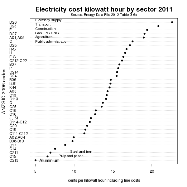
Electricity sales price by sector 2011

This chart shows industrial electricity sectors sorted by average rate (including line costs) in cents per kilowatt hour (i.e. its MWh divided by sales $$ times 100). You need to look at the bottom left hand corner for aluminium smelting, not the top. Thats because NZ Aluminium Smelter Ltd pays the very lowest average rate for electricity in New Zealand; 5.03 cents! Residential users pay 22.6 cents per KWh, or four times as much.

No industry in New Zealand uses more electricity than New Zealand Aluminium Smelters. No industry pays less per unit for electricity than they do. They even get excessively allocated emissions units to help with the lowest priced power contract in New Zealand. And now New Zealand Aluminium Smelters are going for "Godfather" gold by trying to bully their power price even lower.

16 March 2012

Nick Smith 'punchs above his weight' in lukewarm climate policy denial part 1 - the NZ "Kyoto Escalator"

I introduce a 'killer' graphic to look at how Nick Smith is really a "lukewarmer", who - while saying he accepts the science of anthropogenic climate change, nevertheless denies the need to adopt any effective climate policy to reduce greenhouse gas emissions.

The worthy Kennedy Graham of the NZ Green Party recently tried to question Climate Change Minister Nick Smith in Parliament about the inadequacy of New Zealand's reduction targets for emissions of greenhouse gases.

Kennedy Graham, who does not seem to have read the Skeptical Science Debunking Guide, can be a bit verbose in his questions. He describes the debate as "apocryphal". Which ties in my previous theme that debates about climate change politics can quickly degrade into jargon and 'yada yada' that cause MEGO. And this is the definition of flogging the dead horse and swallowing of the elephant in the room.

Nick Smith seems to be aware of this as he typically discusses climate change policy using short catchy "public-relations" sound bites. For example:
I can absolutely assure the member that this Government takes those international negotiations very seriously. I have to say that this House should be very proud of the contribution of the Minister responsible for those international negotiations. Tim Groser is playing a very pivotal role and this country is punching well above its weight in ensuring progress is made.
I would also point out that New Zealand is going to comfortably meet its Kyoto obligations around emissions.

So New Zealand is the real Kiwi battler, "punching above its weight", in terms of climate change policy!! Really. Really? Really!

Smith's specific example is complying with the Kyoto Protocol. For New Zealand, the Kyoto 'outcome' is average greenhouse gas emissions between 2008 and 2012 ('the commitment period') and the 'target' is the 'baseline' of gross emissions in 1990. New Zealand must manage the 'outcome' (2008 to 2012 GHG emissions) so that it meets the 'target' - the 1990 'baseline'.

New Zealand must either reduce average 2008-2012 greenhouse gas emissions to the 1990 volume x 5 years or obtain other Kyoto-compliant emissions units to match the growth in emissions.

The Ministry for the Environment says New Zealand will not just meet the Kyoto target we will probably exceed it by 21 million emissions units.

In reality, according to New Zealand’s Greenhouse Gas Inventory 1990–2009 New Zealand's total (or gross) GHG emissions increased from 1990 to 2009 by 19%. Net emissions (after subtracting forest sequestration) increased by 23%.

So why is Nick Smith saying we comply with Kyoto? Let us recall that New Zealand's ease in complying with the Kyoto Protocol is because of the forests loophole.

The NZ Kyoto 1990 baseline/target is defined as gross emissions - that is without deducting carbon sequestration in forests. The 2008 to 2012 Kyoto 'outcome' emissions are defined as gross emissions less Kyoto compliant emissions units recognised for carbon sequestration in forests after 1990.

Okay that was a bit yada yada. Feeling a bit MEGO?

As an antidote to MEGO here's the Kyoto escalator. Imitating the Skeptical Science temperature escalator it is an animated chart for the New Zealand Kyoto forest loophole. Click on it for a larger version. The chart shows firstly gross GHG emissions in green from 1990, actual to 2008 and projected to 2012. Clearly an increasing trend. Then net emissions after carbon sequestration by forests in blue. Also an increasing trend. Then "Kyoto" accounting of GHG emissions - gross to 2007, then net from 2008 to 2012.

Back In 1997, another National Government Minister for Climate change, Simon Upton, said that New Zealand's climate change policy would lack credibility if New Zealand's interest in forest sinks appeared to be all about gaining a large buffer to allow for significant growth in greenhouse gas emissions. Obviously Nick Smith has no such concerns.

10 November 2011

Temperature time series BEST and GISS

The Berkeley Earth Science Temperature (BEST) project has made quite a splash. There is a good summary in Skeptical Science. See also Mother Jones and The Economist.

I have made my own charts of the Berkeley Earth Science Temperature data using R.
I downloaded the data as a two-column text file from the Wood for Trees website.
Here is a chart of the BEST global land monthly temperature anomalies from 1800 to 2010. What is plotted for each month is the difference from the January 1950 to December 1979 mean. Clicking on each chart will open a 650 by 550 pixel png image in a new window.

BEST average global land temperatures

Okay, but what is the trend in the data. Maybe I should add a moving average trend line.
BEST average global land temperatures with trend

Then I would like to compare the BEST data with the NASA Goddard Institute for Space Studies (NASA GISS) data.

NASA GISS average global land temperatures

BEST vs GISS smoothed

14 July 2011

A trans-Tasman test on agricultual GHG emissions

Apparently the new President of Federated Farmers, Bruce Wills (no relation) intends to be less confrontational and more collaborative than his predecessors when engaging with the environmental concerns of 'urban' New Zealanders. Bruce Wills also says he has a strong interest in the environment.

However, Wills thinks that the lesson of the Australian carbon pricing scheme, announced last Sunday, is that New Zealand should not tax livestock emissions. Agriculture is due to enter the NZ Emissions Trading Scheme on 1 July 2015.

Here is a chart for Bruce which explains why Australia can leave agriculture out of its carbon price scheme and also why New Zealand can't.


Thats right. In 2009, agricultural GHG emissions were 48% of New Zealand's GHG emissions, and 16% of Australia's emissions.

28 April 2011

Who bears the biggest and smallest carbon price under the NZETS?

Who bears the biggest and smallest carbon price under the New Zealand Emissions Trading Scheme?

Geoff Bertram and Simon Terry in their book The Carbon Challenge New Zealands Emissions Trading Scheme, point out that the effect of the delayed entry dates for different sectors of the economy (agriculture) into the NZ ETS combined with 100% plus free gifting of NZ emission units to emitters, will be an unfair carbon price between sectors.

This chart shows who is and is not bearing their share of the carbon price imposed by the NZETS. The left hand end of each line represents the sectors share of New Zealands greenhouse gas emissions. The right hand end of each line represents the share of the carbon price each sector will bear under the NZ ETS in the period 2008 to 2012. This type of chart is a 'Bump' chart. It has been popularised by the blog Junk Charts.


Here is the R-programming language script for the chart.

ag<-c(48.4,3.2)
li<-c(14.8,1.2)
mv<-c(14.5,29)
ct<-c(4.2,9)
hh<-c(4.1,23.3)
yy<-c(2008,2009)
png(file="etsprice.png",pointsize = 14,width=650,height=550)
plot(yy,ag,type='n',axes=F,xlim=c(2008,2009.4),ylim=c(0,48),main="",xlab="", ylab="Percent of total")
axis(side=1, las=0,at=c(2008.3,2009), labels=c("share of greenhouse gases", "share of carbon price in NZETS"))
axis(side=2)
box(lwd=2)
lines(yy,ag,lwd=2,col="red")
text(2009.1,3.2,"Agriculture",adj=0,col=1)
lines(yy,li,lwd=2,col="red1")
text(2009.1,1,"Large industry",adj=0,col=1)
lines(yy,mv,lwd=2,col="blue")
text(2009.1,29,"Private vehicles",adj=0,col=1)
lines(yy,ct,lwd=2,col="blue1")
text(2009.1,9,"Transport",adj=0,col=1)
lines(yy,hh,lwd=2,col="violetred")
text(2009.1,23.3,"Households",adj=0,col=1)
mtext(side=3,line=-2.8,cex=1.3,"Sectoral shares of NZ greenhouse gases \nvs share of carbon price under NZETS")
dev.off()

15 February 2011

Nick Smith mistakes gross and net GHG emissions

Still on the topic of Nick Smith not being able to tell the difference between gross greenhouse gas emissions and net greenhouse gas emissions (after subtracting forest carbon removals).

It needed its own chart. Here it is. Nick Smith's press release of 10 February 2011 says net GHG emissions in 1990 are 61 million tonnes - the large blue dot. That is actually the gross GHG emissions. Russel Norman's press release of February 2011 gives the correct 1990 net GHG emissions 29 million tonnes according to the Ministry for the Environment.

Here is the R code.

Year<-c(1990:2007)
gross<-c(61.84,62.02,63.21,62.94,64.10,64.45,66.02,68.87,66.96,68.60,70.58,73.10,73.44,75.99,75.04,77.16,77.59,75.54)
net<-c(30.77,30.49,32.67,32.29,34.21,35.68,37.31,39.00,35.17,36.15,39.30,42.89,45.85,47.57,47.14,53.37,57.88,58.72)
png(file="Smith.png",pointsize = 16,width=600,height=500)
plot(Year,gross,axes="FALSE",type="n",xlim=c(1990,2007),ylim=c(0,82),xlab="Year",ylab="Emissions (Megatonnes)",main="New Zealand's Gross & Net GHG Emissions 1990 to 2007")
axis(1,line=0,at=Year,labels=Year,lwd=1)
axis(2,lwd=1)
points(Year[1],net[1],pch=19, col=3,lwd=8)
text(1990,23,"Norman's \nNet GHG \nemissions",adj=0, col=1)
points(Year[1],61.7,pch=19, col=4,lwd=8)
text(1990,54,"Smith's \nNet GHG \nemissions",adj=0, col=1)
points(Year,net, type="l",col=3,lwd=2)
points(Year,gross,type="l", col=4,lwd=2)
legend(1996, 25,bty = "n", c("MfE Gross GHG emissions","MfE Net GHG emissions"),lty = c(1,1), pch=c(NA,NA),lwd=c(2,2), col = c(4,3))
mtext(side=1,line=-1.5,cex=0.8,"Source: MfE 2010 New Zealand’s Greenhouse Gas Inventory 1990–2008")
box()
dev.off()

24 January 2011

New Zealand per capita carbon dioxide


I am "quite fond of"/'obsessed with' making charts of variables indicating climate change. Here is a chart I have made with the R (programming language) that I have uploaded to Blogger. The source of the data is a spreadsheet from the report CO2 Emissions from Fuel Combustion (2009 Edition), International Energy Association, Paris.

R is a command-line program. The R code for the chart is:

co2pc <- c(4.80,5.40,5.77,5.98,5.52,6.04,6.20,5.80,5.19,5.22,5.15,
5.63,5.62,5.86,5.99,5.66 ,6.01,6.37,6.41,6.34,6.20,6.73,6.44,6.55,
6.62,6.99,7.67,7.67,8.09,8.36, 8.78,8.76,8.93,8.75,8.84, 8.99,8.48)
years <-c(1971:2007)
plot(years,co2pc,type='o',lwd=2,col=2,ylim=c(0,10),cex.lab=1.2,ylab='tonnes CO2 per capita',xlab='Years')
title(main="New Zealand Carbon Dioxide emissions per capita 1971-2007")
mtext(side=1,line=-1.5,"Source: CO2 Emissions from Fuel Combustion (2009 Edition), IEA, Paris")
abline(h=c(2,4,6,8,10),col='lightgrey',lwd=2,lty=2)
abline(v=c(1975,1980,1985,1990,1995,2000,2005),col='lightgrey',lwd=2,lty=2)
box(lwd=3)


I have recently used Flickr to store a couple of these charts. And you can embed them in a blog. Hence here is a chart of New Zealand emissions of Carbon Dioxide per capita from 1971 to 2007.
New Zealand emissions of Carbon Dioxide per capita 1971 to 2007

However it looks a bit fuzzy compared to the image uploaded to Blogger. It looks better over at Flickr.


Someone has asked NZ's line isn't very straight, is it? I wonder what happened in the mid 90s? Good question.